Technical Analysis Explained by IFC Markets - HTML preview
Download the book in PDF, ePub, Kindle for a complete version.
Chapter II
Trend In Terms of Technical Analysis
Trend represents one of the most essential concepts in technical analysis. All the tools that an analyst uses have a single purpose: help to identify the market trend. The expressions like “trend is your friend” or “Never buck the trend” are not used accidental y. The meaning they contain is more than deeper. So, it is worth properly understanding what the trend is and what type of trend is possible to differentiate.
2.1. Definition of Trend
The meaning of trend is not so much different from its general meaning-it is nothing more than the direction in which a market moves. But more precisely, market does not move in a straight line, its moves are characterized by a series of zigzags which resemble successive waves with clear peaks and troughs or highs and lows, as they are often called. Thus, in technical analysis it is the movement of those highs and lows that form a trend.
Thus, trend is the direction of market indicated by successive peaks and troughs.
2.2. Types of Trends
As we mentioned above trend is comprised of a series of highs and lows, and depending on the movement of those peaks and troughs one can understand the trend’s type in market.
Though most people think that market can be either upward or downward, actually there exist not two but three types of trends:
1. Uptrend
2. Downtrend
3. Sideways
An uptrend is defined as a series of higher peaks and higher troughs
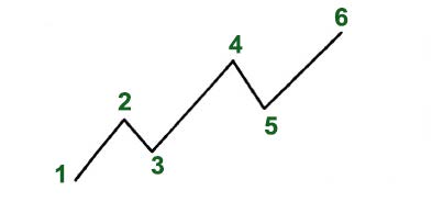
Figure 2.1 An example of an uptrend with ascending highs and lows
As it is clearly mentioned on the chart, the points stand for identifying highs and lows. The first peak represents the point 2 which is determined after the price falls from that point. Herein, point 3 is the trough which is determined after the price falls from the peak. And this should be continuous so that each successive trough must not fall below the previous lowest point. Only in that case the trend can be accepted as an uptrend, otherwise the trend is considered reversal.
A downtrend is right the opposite; it is formed of lower peaks and lower troughs
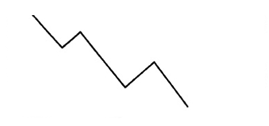
Figure 2.2 An example of a downtrend with descending peaks and lows
A sideways trend is constituted of many horizontal peaks and troughs, and there is no obvious indication of trend. The direction in which the security price moves is absolutely opaque.
This type of market direction is sometimes referred as “trendless”. This kind of action reflects the period when the forces of supply and demand are in a relative balance. The wide variety of technical analysis tools which are primarily designed to follow the trend become powerless when market enters this “trendless” phase. It is during these periods that traders fail and experience great losses. The failure does not depend on the trend-following system; the system needs a trend to do its work. The reason is hidden in the trader who strives to apply the trend-following system in a non-trending market.
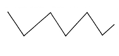
Figure 2.3 An example of a sidewise trend with horizontal peaks and troughs
Traders and investors confront three types of decisions: go long, i.e. to buy, go short, i.e. to sell, or stay aside, i.e. to do nothing. During any type of trend they should develop a specific strategy. The buying strategy is preferable when the market goes up and conversely the selling strategy would be right when the market goes down. But when the market moves sideways the third option – to stay aside-will be the wisest decision.
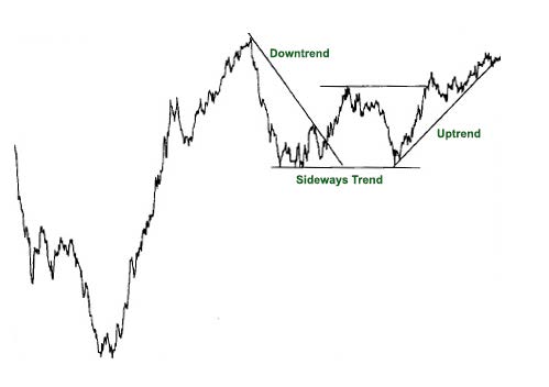
Figure 2.4. An example of a downtrend which gradually turns into an uptrend. The first part shows a downtrend, then the market moves sideways and starts to go up.
2.3. Support and Resistance Levels
Troughs and peaks in technical analysis are usually mentioned by their appropriate names which are support and resistance respectively.
The term support indicates the area on the chart where the buying interest is significantly strong and surpasses the selling pressure. It is usually marked by previous troughs. In an uptrend of the figure 2.5 the points 2 and 4 are considered support levels.
Resistance level, contrary to the support level, represents an area on the chart where selling interest overcomes buying pressure. It is usually marked by previous peaks. The points 1 and 3 in the figure identify resistance levels.
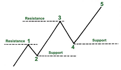
Figure 2.5 Rising support and resistance levels in an uptrend
The image is different with a downtrend (see Figure 2.6) which is composed of descending peaks and troughs. In a downtrend the points 1 and 3 indicate support levels and, consequently, the points 2 and 4 show resistance levels.
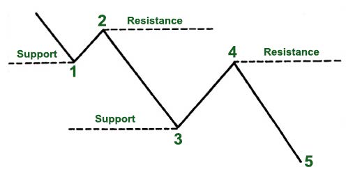
Figure 2.6 Falling support and resistance levels in a downtrend
For an uptrend to go on each successive support level should be higher than the preceding one, and each successive resistance level should be higher than the one preceding it. In case this is not so, for instance, if the support level comes down to the previous trough, it may signify that the uptrend is coming to the end or at least it is turning into a sideways trend. It is likely that trend reversal from up to down will occur.
The opposite situation takes place in a downtrend; the failure of each support level to move lower than the previous trough may again signal changes in the existing trend.
2.4. Trend Reversal
Another interesting aspect of trend is the reversal of support and resistance levels, which is known as "trend reversal", "rally" or "correction".
An uptrend which is defined by successive higher highs and higher lows can reverse into a downtrend by changing to successive lower highs and lower lows.
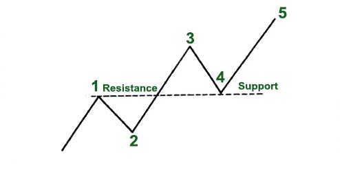
Figure 2.7 Trend reversal in an uptrend
A downtrend, which is defined by lower highs and lower lows, can reverse into an uptrend by changing into successive higher highs and higher lows. To put it more bluntly, a resistance level becomes a support level, and a support level becomes a resistance level.
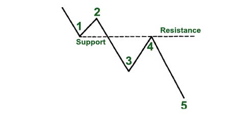
Figure 2.8 Trend reversal in a downtrend
A reversal can be either a positive or a negative change against the prevailing trend. This is of high significance for market participants and analysts, since those patterns indicate the necessity of taking another trading strategy on the same security.
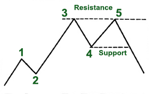
Figure 2.9 Downside trend reversal
As it is clearly shown in the picture, point 5 fails to exceed the previous peak (point 3) and is followed by a trough which violates the previous low (point 4). This type of pattern is called a double top which we will discuss in chapter 3.
To understand this properly, let’s group traders and other market participants into three categories: the longs, the shorts and the uncommitted.
The longs are the ones who have already bought a security, the shorts are those who have already sold it and the uncommitted form the group of participants who either remain undecided or have exited the market. Once the market starts moving higher from the support level the longs will be delighted only regretting for not having bought more. But this will create a negative situation for the shorts, who will appear on the wrong side of the market and only hope for a dip back to the area where they went short, so that they can get out of the market they got in.
The group of undecided realizing that prices are increasing will decide to enter the market on the long side.
All the mentioned members have a great interest in that support area. The importance of the support and resistance areas is strengthened based on the volume, time spent there and how recently the trade has taken place.
2.5. Trendline
Another technical tool applied by a chartist is the trendline. Drawing a trendline does not cause any difficulty, it is as simple as drawing a straight line which follows the trend. The line is used for indicating the trend and also identifying trend reversals.
There can be distinguished two types of trendlines: up trendline and down trendline. An up trendline is a straight line drawn upward to the right along successive lows. A down trendline is drawn downward to the right along successive highs.
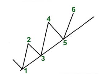
Figure 2.10 An up trendline which is drawn under the rising reaction lows
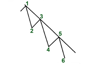
Figure 2.11 A down trendline which is drawn over successively falling highs
Drawing a correct trendline, like any other aspect of technical analysis, requires practice and experiment with different lines before finding the correct one. There are certain factors that are very useful in this respect.
Firstly, the trend should be clear and evident. So, for drawing an up trendline there must be at least two reaction lows where the second low is higher than the first. Thus, at least two exact points are necessary to draw any straight line. This refers to a tentative trendline. In order to confirm the validity of the trendline, third point becomes necessary. This kind of trendline is referred to as a valid trendline.
As long as the trendline is stable, it can be used as a determinant of buying and selling areas. But once it is violated, it is one of the best warnings of a change in trend.
The significance of a trendline is determined by the duration it has been intact and by the number of times it has been tested. A trendline which has been touched for 10 times is more significant than the one which has been tested for only three times. Similarly, a trendline would be of more importance if being in effect for 7 months rather than for 7days.
More significance of a trendline indicates more confidence and more important penetration.
Fan Principle
There are situations when prices rally back on the level of trendline. In such cases, after the break, a new trendline is drawn and the previous one becomes a resistance line. Similarly, if the first trendline is violated, the third one is drawn. And if the price breaks the third line, it is most likely that trend reversal will take place.
In figure 2.12 it is shown how prices rallied to but failed to penetrate line 1. Line 2, second trendline, is also broken. After another rally fails, a third line is drawn. The break of that third trendline usually indicates that prices are moving lower.
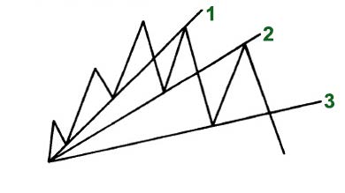
Figure 2.12
This kind of situation is referred as “Fan principle” whose name derives from the appearance of the lines that resemble a fan. Here it is important to note that the breaking of the third line is a signal of valid trend reversal.
2.6. Channel Line
Channel lines, or as they are sometimes called return lines, are additions of two parallel trendlines which act as support and resistance levels. As we have already covered, an up trendline connects a series of peaks, while a down trendline connects a series of troughs.
Drawing a channel line is quite simple. If we want to draw it in an uptrend, firstly it is important to draw the basic up trendline along the lows as shown in the figure 2.13 (points 1, 3, 5). Then it follows to draw a dotted line parallel to the basic trendline (starting from the first peak, point 2). Both the dotted and basic lines move in the right direction forming a channel. If the price increases and the next rally reaches and backs off from the channel line (mentioned by point 4), then a channel may exist. And if the price declines and falls back to the trendline, (shown by point 5), then we can say that a channel exists.
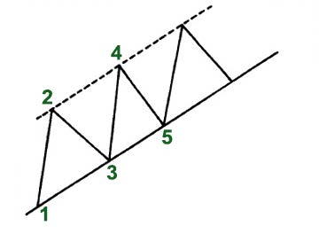
Figure 2.13
The same can be said for a downtrend, however in the opposite direction.
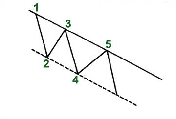
Figure 2.14
Whether a channel is upward or downward, its interpretation is the same. Traders and investors expect a particular security to trade between support and resistance levels, until it breaks beyond one of these levels. Aside from clearly indicating the trend, channels are mainly used to illustrate the important areas of support and resistance. They can be used for short term profit taking. Like a trendline, the longer the channel remains intact and the more often it is successfully tested, the more reliable it becomes. While the breaking of the basic trendline indicates an important change in trend, the breaking of a rising channel line indicates an acceleration of the existing trend.
It should be noted that the basic trendline is much more reliable. The channel which is often included in the toolkit of a chartist, is considered a secondary use of trendline technique.
2.7. Percentage Retracements
While following the market movements one can easily notice that after a particular move, prices retrace the previous trend by some percent before continuing in the original direction. The amount that prices retreat from the high to the low can be measured using the technique “percentage retracement”.
Let’s bring an example. If a market trends high reaching from 100 level to 200, in most cases the price retraces nearly half of the move (at about 150 level). This kind of phenomenon is known as 50% retracement and happens quite often.
Besides 50% retracement, there exist the one-third and the two-thirds retracements. Different approaches offer different amounts of minimum and maximum retracements. Thus, according to Dow Theory, there are 3 percentage retracements-33%, 50% and 66%. But as for Elliot Wave Theory and Fibonacci ratios, the minimum and maximum retracements are 38% and 62%.
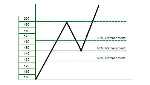
Figure 2.15
This means that usually during a trend correction the market retraces at least one-third of the previous move. It is very important for traders to be aware of such information and use the buying and selling opportunities correctly. If the trader wants to find a beneficial buying area he can compute a 33-50% area on the chart and use that zone for buying decisions. If the trader wants to find a beneficial selling area he can compute a 62-66% area on the chart and use that zone for selling decisions.
The maximum retracement usually creates a critical area. If the correction stops at the two-thirds point it becomes a less risky area in an uptrend for buying and in a downtrend for selling. In case prices surpass the maximum point, the condition from retracement turns into trend reversal.
2.8. Price Gaps
Price gaps represent such areas on a chart where no kind of trade has been executed. They are open spaces on a chart which mostly appear on daily bar charts but can be seen on weekly and monthly charts as well .
Gaps can be of three types: breakaway, runaway/measuring and exhaustion.
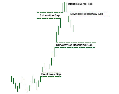
Figure 2.16
The breakaway gap appears when an important price pattern is completed and usually indicates the beginning of an essential market move. It can also be seen when a major trendline breaks and signals a reversal pattern. Breakaway gap usually is not filled.
The runaway or measuring gap appears somewhere in the middle of the move when prices form a second type of gap. In an uptrend this kind of gap indicates a market strength, while in a downtrend it’s a sign of market weakness.
The exhaustion gap appears near the end of the market move when the breakaway and runaway gaps have already been identified. Sometimes after the formation of exhaustion gap prices trade in a narrow range for a few days and only then gap to the downside. The exhaustion gap to the upside which is followed by a breakaway gap to the downside completes the island reversal pattern and usually looks like an “island surrounded by water or space''.
2.9. Trend Classification
Actually, trends can be of different lengths ranging from very short term trends that cover minutes and hours to very long term trends which can last a decade. However, technicians classify trends into three main groups: long-term, intermediate and short-term trends.
Long–term trend, which is also known as major trend, is considered the trend which lasts longer than a year.
An intermediate trend is defined as a one-to-three-month trend and a short-term, or so called near-term trend, is expected to last less than a month.
Each trend can become a portion of the next larger trend. For example, a long term trend consists of several intermediate trends which usually move against the long-term trend and are referred as corrections. If a long-term trend is upward and the market pauses to correct itself for some period to resume its upward path, the correction is considered to be an intermediate trend.
Short–term trends in their turn are components of intermediate and long-term trends. This procedure that each trend is a part of the next larger trend and consists of smaller trends takes place many times (see figure 2.17).
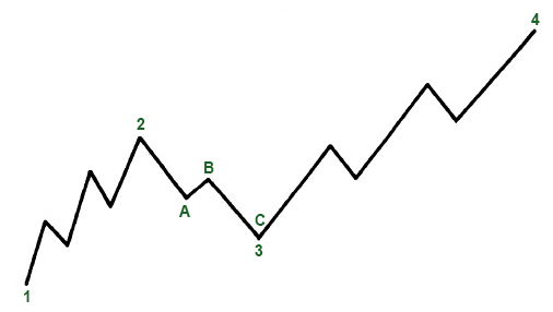
Figure 2.17
In the displayed figure the long term upward trend is shown by peaks and troughs mentioned by the points 1, 2, 3, 4. The points 2 and 3 represent intermediate trend and show the corrective phase within the major trend. Moreover, this intermediate trend consists of three smaller trends, near trends (points A, B, C). At point C the major trend seems to be stil up, whereas the intermediate and near term trends are down. At point 4 all the trends are up. Therefore, it becomes very difficult to tell the exact trend in a given market, and analysts usually define it by different trend classifications, discussed in our example.
How traders perceive a trend may cause a bit of misunderstanding while defining a trend. For a trader of a long-term position a few days' price action may be unimportant, while for a day trader the same time frame may be accepted as a major trend. Thus, it is also important to understand and take into account different degrees of trend.
Another important factor in trend analysis is the usage of a right chart which is constructed to best reflect the type of trend. So, daily charts are mainly used to analyze intermediate and short-term trends.
The longer the trend, the more significant it is, e.g. a one-month trend is not considered as much important as a two-year trend.
Conclusion
In this chapter we presented the core features of chart analysis, including channels and trendlines, support and resistance levels, gaps and percentage retracements. We also covered the main classes of trends whose identification helps to trade with and not against the market.