Collaborative Statistics by Robert Gallagher - HTML preview
Download the book in PDF, ePub, Kindle for a complete version.
2.10.7 Data Statistics
Calculate the following values:
Exercise 2.10.5
(Solution on p. 97.)
Sample mean = x =
Exercise 2.10.6
(Solution on p. 97.)
Sample standard deviation = sx =
Exercise 2.10.7
(Solution on p. 97.)
Sample size = n =
2.10.8 Calculations
Use the table in section 2.11.3 to calculate the following values:
Exercise 2.10.8
(Solution on p. 97.)
Median =
Exercise 2.10.9
(Solution on p. 97.)
Mode =
Exercise 2.10.10
(Solution on p. 97.)
First quartile =
Exercise 2.10.11
(Solution on p. 97.)
Second quartile = median = 50th percentile =
Exercise 2.10.12
(Solution on p. 97.)
Third quartile =
Exercise 2.10.13
(Solution on p. 97.)
Interquartile range (IQR) = _____ - _____ = _____
Exercise 2.10.14
(Solution on p. 97.)
10th percentile =
Exercise 2.10.15
(Solution on p. 97.)
70th percentile =
74
CHAPTER 2. DESCRIPTIVE STATISTICS
Exercise 2.10.16
(Solution on p. 97.)
Find the value that is 3 standard deviations:
a. Above the mean
b. Below the mean
2.10.9 Box Plot
Construct a box plot below. Use a ruler to measure and scale accurately.
2.10.10 Interpretation
Looking at your box plot, does it appear that the data are concentrated together, spread out evenly, or
concentrated in some areas, but not in others? How can you tell?
75
2.11 Practice 2: Spread of the Data14
2.11.1 Student Learning Outcomes
• The student will calculate measures of the center of the data.
• The student will calculate the spread of the data.
2.11.2 Given
The population parameters below describe the full-time equivalent number of students (FTES) each year
at Lake Tahoe Community College from 1976-77 through 2004-2005. (Source: Graphically Speaking by Bill
King, LTCC Institutional Research, December 2005 ).
Use these values to answer the following questions:
• µ = 1000 FTES
• Median - 1014 FTES
• σ = 474 FTES
• First quartile = 528.5 FTES
• Third quartile = 1447.5 FTES
• n = 29 years
2.11.3 Calculate the Values
Exercise 2.11.1
(Solution on p. 97.)
A sample of 11 years is taken. About how many are expected to have a FTES of 1014 or above?
Explain how you determined your answer.
Exercise 2.11.2
(Solution on p. 97.)
75% of all years have a FTES:
a. At or below:
b. At or above:
Exercise 2.11.3
(Solution on p. 97.)
The population standard deviation =
Exercise 2.11.4
(Solution on p. 97.)
What percent of the FTES were from 528.5 to 1447.5? How do you know?
Exercise 2.11.5
(Solution on p. 97.)
What is the IQR? What does the IQR represent?
Exercise 2.11.6
(Solution on p. 98.)
How many standard deviations away from the mean is the median?
14This content is available online at <http://cnx.org/content/m17105/1.11/>.
76
CHAPTER 2. DESCRIPTIVE STATISTICS
2.12 Homework15
Exercise 2.12.1
(Solution on p. 98.)
Twenty-five randomly selected students were asked the number of movies they watched the pre-
vious week. The results are as follows:
# of movies
Frequency
Relative Frequency
Cumulative Relative Frequency
0
5
1
9
2
6
3
4
4
1
Table 2.12
a. Find the sample mean x
b. Find the sample standard deviation, s
c. Construct a histogram of the data.
d. Complete the columns of the chart.
e. Find the first quartile.
f. Find the median.
g. Find the third quartile.
h. Construct a box plot of the data.
i. What percent of the students saw fewer than three movies?
j. Find the 40th percentile.
k. Find the 90th percentile.
l. Construct a line graph of the data.
m. Construct a stem plot of the data.
Exercise 2.12.2
The median age for U.S. blacks currently is 30.1 years; for U.S. whites it is 36.6 years. (Source: U.S.
Census)
a. Based upon this information, give two reasons why the black median age could be lower than
the white median age.
b. Does the lower median age for blacks necessarily mean that blacks die younger than whites?
Why or why not?
c. How might it be possible for blacks and whites to die at approximately the same age, but for
the median age for whites to be higher?
Exercise 2.12.3
(Solution on p. 98.)
Forty randomly selected students were asked the number of pairs of sneakers they owned. Let X
= the number of pairs of sneakers owned. The results are as follows:
15This content is available online at <http://cnx.org/content/m16801/1.21/>.
77
X
Frequency
Relative Frequency
Cumulative Relative Frequency
1
2
2
5
3
8
4
12
5
12
7
1
Table 2.13
a. Find the sample mean x
b. Find the sample standard deviation, s
c. Construct a histogram of the data.
d. Complete the columns of the chart.
e. Find the first quartile.
f. Find the median.
g. Find the third quartile.
h. Construct a box plot of the data.
i. What percent of the students owned at least five pairs?
j. Find the 40th percentile.
k. Find the 90th percentile.
l. Construct a line graph of the data
m. Construct a stem plot of the data
Exercise 2.12.4
600 adult Americans were asked by telephone poll, What do you think constitutes a middle-class
income? The results are below. Also, include left endpoint, but not the right endpoint. (Source:
Time magazine; survey by Yankelovich Partners, Inc.)
NOTE: "Not sure" answers were omitted from the results.
Salary ($)
Relative Frequency
< 20,000
0.02
20,000 - 25,000
0.09
25,000 - 30,000
0.19
30,000 - 40,000
0.26
40,000 - 50,000
0.18
50,000 - 75,000
0.17
75,000 - 99,999
0.02
100,000+
0.01
Table 2.14
a. What percent of the survey answered "not sure" ?
78
CHAPTER 2. DESCRIPTIVE STATISTICS
b. What percent think that middle-class is from $25,000 - $50,000 ?
c. Construct a histogram of the data
a. Should all bars have the same width, based on the data? Why or why not?
b. How should the <20,000 and the 100,000+ intervals be handled? Why?
d. Find the 40th and 80th percentiles
e. Construct a bar graph of the data
Exercise 2.12.5
(Solution on p. 98.)
Following are the published weights (in pounds) of all of the team members of the San Francisco
49ers from a previous year (Source: San Jose Mercury News)
177; 205; 210; 210; 232; 205; 185; 185; 178; 210; 206; 212; 184; 174; 185; 242; 188; 212; 215; 247; 241;
223; 220; 260; 245; 259; 278; 270; 280; 295; 275; 285; 290; 272; 273; 280; 285; 286; 200; 215; 185; 230;
250; 241; 190; 260; 250; 302; 265; 290; 276; 228; 265
a. Organize the data from smallest to largest value.
b. Find the median.
c. Find the first quartile.
d. Find the third quartile.
e. Construct a box plot of the data.
f. The middle 50% of the weights are from _______ to _______.
g. If our population were all professional football players, would the above data be a sample of
weights or the population of weights? Why?
h. If our population were the San Francisco 49ers, would the above data be a sample of weights
or the population of weights? Why?
i. Assume the population was the San Francisco 49ers. Find:
i. the population mean, µ.
ii. the population standard deviation, σ.
iii. the weight that is 2 standard deviations below the mean.
iv. When Steve Young, quarterback, played football, he weighed 205 pounds. How many
standard deviations above or below the mean was he?
j. That same year, the average weight for the Dallas Cowboys was 240.08 pounds with a standard
deviation of 44.38 pounds. Emmit Smith weighed in at 209 pounds. With respect to his team,
who was lighter, Smith or Young? How did you determine your answer?
Exercise 2.12.6
An elementary school class ran 1 mile in an average of 11 minutes with a standard deviation of
3 minutes. Rachel, a student in the class, ran 1 mile in 8 minutes. A junior high school class ran
1 mile in an average of 9 minutes, with a standard deviation of 2 minutes. Kenji, a student in the
class, ran 1 mile in 8.5 minutes. A high school class ran 1 mile in an average of 7 minutes with a
standard deviation of 4 minutes. Nedda, a student in the class, ran 1 mile in 8 minutes.
a. Why is Kenji considered a better runner than Nedda, even though Nedda ran faster than he?
b. Who is the fastest runner with respect to his or her class? Explain why.
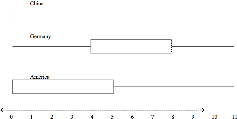
Exercise 2.12.7
In a survey of 20 year olds in China, Germany and America, people were asked the number of
foreign countries they had visited in their lifetime. The following box plots display the results.
79
a. In complete sentences, describe what the shape of each box plot implies about the distribution
of the data collected.
b. Explain how it is possible that more Americans than Germans surveyed have been to over eight
foreign countries.
c. Compare the three box plots. What do they imply about the foreign travel of twenty year old
residents of the three countries when compared to each other?
Exercise 2.12.8
One hundred teachers attended a seminar on mathematical problem solving. The attitudes of
a representative sample of 12 of the teachers were measured before and after the seminar. A
positive number for change in attitude indicates that a teacher’s attitude toward math became
more positive. The twelve change scores are as follows:
3; 8; -1; 2; 0; 5; -3; 1; -1; 6; 5; -2
a. What is the average change score?
b. What is the standard deviation for this population?
c. What is the median change score?
d. Find the change score that is 2.2 standard deviations below the mean.
Exercise 2.12.9
(Solution on p. 99.)
Three students were applying to the same graduate school. They came from schools with different
grading systems. Which student had the best G.P.A. when compared to his school? Explain how
you determined your answer.
Student
G.P.A.
School Ave. G.P.A.
School Standard Deviation
Thuy
2.7
3.2
0.8
Vichet
87
75
20
Kamala
8.6
8
0.4
Table 2.15
80
CHAPTER 2. DESCRIPTIVE STATISTICS
Exercise 2.12.10
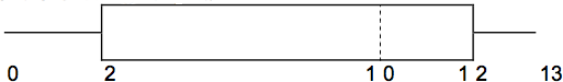
Given the following box plot:
a. Which quarter has the smallest spread of data? What is that spread?
b. Which quarter has the largest spread of data? What is that spread?
c. Find the Inter Quartile Range (IQR).
d. Are there more data in the interval 5 - 10 or in the interval 10 - 13? How do you know this?
e. Which interval has the fewest data in it? How do you know this?
I. 0-2
II. 2-4
III. 10-12
IV. 12-13
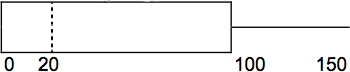
Exercise 2.12.11
Given the following box plot:
a. Think of an example (in words) where the data might fit into the above box plot. In 2-5 sen-
tences, write down the example.
b. What does it mean to have the first and second quartiles so close together, while the second to
fourth quartiles are far apart?
Exercise 2.12.12
Santa Clara County, CA, has approximately 27,873 Japanese-Americans. Their ages are as follows.
(Source: West magazine)
Age Group
Percent of Community
0-17
18.9
18-24
8.0
25-34
22.8
35-44
15.0
45-54
13.1
55-64
11.9
65+
10.3
Table 2.16
a. Construct a histogram of the Japanese-American community in Santa Clara County, CA. The
bars will not be the same width for this example. Why not?
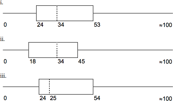
81
b. What percent of the community is under age 35?
c. Which box plot most resembles the information above?
Exercise 2.12.13
Suppose that three book publishers were interested in the number of fiction paperbacks adult
consumers purchase per month. Each publisher conducted a survey. In the survey, each asked
adult consumers the number of fiction paperbacks they had purchased the previous month. The
results are below.
Publisher A
# of books
Freq.
Rel. Freq.
0
10
1
12
2
16
3
12
4
8
5
6
6
2
8
2
Table 2.17
82
CHAPTER 2. DESCRIPTIVE STATISTICS
Publisher B
# of books
Freq.
Rel. Freq.
0
18
1
24
2
24
3
22
4
15
5
10
7
5
9
1
Table 2.18
Publisher C
# of books
Freq.
Rel. Freq.
0-1
20
2-3
35
4-5
12
6-7
2
8-9
1
Table 2.19
a. Find the relative frequencies for each survey. Write them in the charts.
b. Using either a graphing calculator, computer, or by hand, use the frequency column to construct
a histogram for each publisher’s survey. For Publishers A and B, make bar widths of 1. For
Publisher C, make bar widths of 2.
c. In complete sentences, give two reasons why the graphs for Publishers A and B are not identical.
d. Would you have expected the graph for Publisher C to look like the other two graphs? Why or
why not?
e. Make new histograms for Publisher A and Publisher B. This time, make bar widths of 2.
f. Now, compare the graph for Publisher C to the new graphs for Publishers A and B. Are the
graphs more similar or more different? Explain your answer.
Exercise 2.12.14
Often, cruise ships conduct all on-board transactions, with the exception of gambling, on a cash-
less basis. At the end of the cruise, guests pay one bill that covers all on-board transactions. Sup-
pose that 60 single travelers and 70 couples were surveyed as to their on-board bills for a seven-day
cruise from Los Angeles to the Mexican Riviera. Below is a summary of the bills for each group.
83
Singles
Amount($)
Frequency
Rel. Frequency
51-100
5
101-150
10
151-200
15
201-250
15
251-300
10
301-350
5
Table 2.20
Couples
Amount($)
Frequency
Rel. Frequency
100-150
5
201-250
5
251-300
5
301-350
5
351-400
10
401-450
10
451-500
10
501-550
10
551-600
5
601-650
5
Table 2.21
a. Fill in the relative frequency for each group.
b. Construct a histogram for the Singles group. Scale the x-axis by $50. widths. Use relative
frequency on the y-axis.
c. Construct a histogram for the Couples group. Scale the x-axis by $50. Use relative frequency on
the y-axis.
d. Compare the two graphs:
i. List two similarities between the graphs.
ii. List two differences between the graphs.
iii. Overall, are the graphs more similar or different?
e. Construct a new graph for the Couples by hand. Since each couple is paying for two indi-
viduals, instead of scaling the x-axis by $50, scale it by $100. Use relative frequency on the
y-axis.
f. Compare the graph for the Singles with the new graph for the Couples:
i. List two similarities between the graphs.
ii. Overall, are the graphs more similar or different?
84
CHAPTER 2. DESCRIPTIVE STATISTICS
i. By scaling the Couples graph differently, how did it change the way you compared it to the
Singles?
j. Based on the graphs, do you think that individuals spend the same amount, more or less, as
singles as they do person by person in a couple? Explain why in one or two complete sen-
tences.
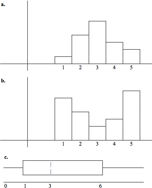
Exercise 2.12.15
(Solution on p. 99.)
Refer to the following histograms and box plot. Determine which of the following are true and
which are false. Explain your solution to each part in complete sentences.
a. The medians for all three graphs are the same.
b. We cannot determine if any of the means for the three graphs is different.
c. The standard deviation for (b) is larger than the standard deviation for (a).
d. We cannot determine if any of the third quartiles for the three graphs is different.
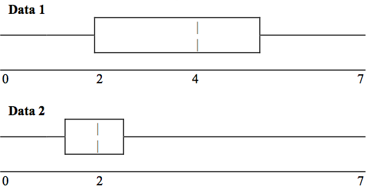
Exercise 2.12.16
Refer to the following box plots.
85
a. In complete sentences, explain why each statement is false.
i. Data 1 has more data values above 2 than Data 2 has above 2.
ii. The data sets cannot have the same mode.
iii. For Data 1, there are more data values below 4 than there are above 4.
b. For which group, Data 1 or Data 2, is the value of “7” more likely to be an outlier? Explain why
in complete sentences
Exercise 2.12.17
(Solution on p. 99.)
In a recent issue of the IEEE Spectrum, 84 engi