Collaborative Statistics by Robert Gallagher - HTML preview
Download the book in PDF, ePub, Kindle for a complete version.
Chapter 2
Descriptive Statistics
2.1 Descriptive Statistics1
2.1.1 Student Learning Outcomes
By the end of this chapter, the student should be able to:
• Display data graphically and interpret graphs: stemplots, histograms and boxplots.
• Recognize, describe, and calculate the measures of location of data: quartiles and percentiles.
• Recognize, describe, and calculate the measures of the center of data: mean, median, and mode.
• Recognize, describe, and calculate the measures of the spread of data: variance, standard deviation,
and range.
2.1.2 Introduction
Once you have collected data, what will you do with it? Data can be described and presented in many
different formats. For example, suppose you are interested in buying a house in a particular area. You may
have no clue about the house prices, so you might ask your real estate agent to give you a sample data set
of prices. Looking at all the prices in the sample often is overwhelming. A better way might be to look
at the median price and the variation of prices. The median and variation are just two ways that you will
learn to describe data. Your agent might also provide you with a graph of the data.
In this chapter, you will study numerical and graphical ways to describe and display your data. This area
of statistics is called "Descriptive Statistics" . You will learn to calculate, and even more importantly, to
interpret these measurements and graphs.
2.2 Displaying Data2
A statistical graph is a tool that helps you learn about the shape or distribution of a sample. The graph can
be a more effective way of presenting data than a mass of numbers because we can see where data clusters
and where there are only a few data values. Newspapers and the Internet use graphs to show trends and
to enable readers to compare facts and figures quickly.
Statisticians often graph data first to get a picture of the data. Then, more formal tools may be applied.
1This content is available online at <http://cnx.org/content/m16300/1.9/>.
2This content is available online at <http://cnx.org/content/m16297/1.9/>.
45
46
CHAPTER 2. DESCRIPTIVE STATISTICS
Some of the types of graphs that are used to summarize and organize data are the dot plot, the bar chart,
the histogram, the stem-and-leaf plot, the frequency polygon (a type of broken line graph), pie charts, and
the boxplot. In this chapter, we will briefly look at stem-and-leaf plots, line graphs and bar graphs. Our
emphasis will be on histograms and boxplots.
2.3 Stem and Leaf Graphs (Stemplots), Line Graphs and Bar Graphs3
One simple graph, the stem-and-leaf graph or stemplot, comes from the field of exploratory data analysis.It
is a good choice when the data sets are small. To create the plot, divide each observation of data into a stem
and a leaf. The leaf consists of a final significant digit. For example, 23 has stem 2 and leaf 3. Four hundred
thirty-two (432) has stem 43 and leaf 2. Five thousand four hundred thirty-two (5,432) has stem 543 and leaf
2. The decimal 9.3 has stem 9 and leaf 3. Write the stems in a vertical line from smallest the largest. Draw a
vertical line to the right of the stems. Then write the leaves in increasing order next to their corresponding
stem.
Example 2.1
For Susan Dean’s spring pre-calculus class, scores for the first exam were as follows (smallest to
largest):
33; 42; 49; 49; 53; 55; 55; 61; 63; 67; 68; 68; 69; 69; 72; 73; 74; 78; 80; 83; 88; 88; 88; 90; 92; 94; 94; 94; 94;
96; 100
Stem-and-Leaf Diagram
Stem
Leaf
3
3
4
299
5
355
6
1378899
7
2348
8
03888
9
0244446
10
0
Table 2.1
The stemplot shows that most scores fell in the 60s, 70s, 80s, and 90s. Eight out of the 31 scores or
approximately 26% of the scores were in the 90’s or 100, a fairly high number of As.
The stemplot is a quick way to graph and gives an exact picture of the data. You want to look for an overall
pattern and any outliers. An outlier is an observation of data that does not fit the rest of the data. It is
sometimes called an extreme value. When you graph an outlier, it will appear not to fit the pattern of the
graph. Some outliers are due to mistakes (for example, writing down 50 instead of 500) while others may
indicate that something unusual is happening. It takes some background information to explain outliers.
In the example above, there were no outliers.
Example 2.2
Create a stem plot using the data:
3This content is available online at <http://cnx.org/content/m16849/1.15/>.
47
1.1; 1.5; 2.3; 2.5; 2.7; 3.2; 3.3; 3.3; 3.5; 3.8; 4.0; 4.2; 4.5; 4.5; 4.7; 4.8; 5.5; 5.6; 6.5; 6.7; 12.3
The data are the distance (in kilometers) from a home to the nearest supermarket.
Problem
(Solution on p. 95.)
1. Are there any outliers?
2. Do the data seem to have any concentration of values?
HINT: The leaves are to the right of the decimal.
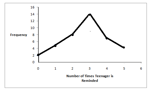
Another type of graph that is useful for specific data values is a line graph. In the particular line graph
shown in the example, the x-axis consists of data values and the y-axis consists of frequency points. The
frequency points are connected.
Example 2.3
In a survey, 40 mothers were asked how many times per week a teenager must be reminded to do
his/her chores. The results are shown in the table and the line graph.
Number of times teenager is reminded
Frequency
0
2
1
5
2
8
3
14
4
7
5
4
Table 2.2
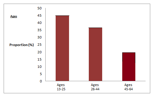
Bar graphs consist of bars that are separated from each other. The bars can be rectangles or they can be
rectangular boxes and they can be vertical or horizontal.
The bar graph shown in Example 4 has age groups represented on the x-axis and proportions on the y-axis.
48
CHAPTER 2. DESCRIPTIVE STATISTICS
Example 2.4
By the end of 2011, in the United States, Facebook had over 146 million users.
The table
shows three age groups, the number of users in each age group and the proportion (%) of
users in each age group. Source: http://www.kenburbary.com/2011/03/facebook-demographics-
revisited-2011-statistics-2/
Age groups
Number of Facebook users
Proportion (%) of Facebook users
13 - 25
65,082,280
45%
26 - 44
53,300,200
36%
45 - 64
27,885,100
19%
Table 2.3
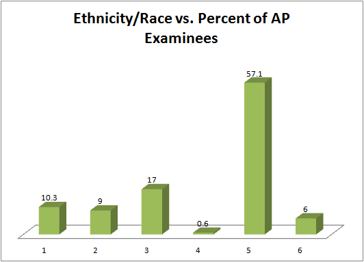
Example 2.5
The columns in the table below contain the race/ethnicity of U.S. Public Schools: High School
Class of 2011, percentages for the Advanced Placement Examinee Population for that class
and percentages for the Overall Student Population.
The 3-dimensional graph shows the
Race/Ethnicity of U.S. Public Schools (qualitative data) on the x-axis and Advanced Placement
Examinee Population percentages on the y-axis. (Source: http://www.collegeboard.com and
Source: http://apreport.collegeboard.org/goals-and-findings/promoting-equity)
Race/Ethnicity
AP Examinee Population
Overall Student Population
1 = Asian, Asian American or Pa-
10.3%
5.7%
cific Islander
continued on next page
49
2 = Black or African American
9.0%
14.7%
3 = Hispanic or Latino
17.0%
17.6%
4 = American Indian or Alaska
0.6%
1.1%
Native
5 = White
57.1%
59.2%
6 = Not reported/other
6.0%
1.7%
Table 2.4
Go to Outcomes of Education Figure 224 for an example of a bar graph that shows unemployment rates of
persons 25 years and older for 2009.
NOTE: This book contains instructions for constructing a histogram and a box plot for the TI-83+
and TI-84 calculators. You can find additional instructions for using these calculators on the Texas
Instruments (TI) website5 .
2.4 Histograms6
For most of the work you do in this book, you will use a histogram to display the data. One advantage of a
histogram is that it can readily display large data sets. A rule of thumb is to use a histogram when the data
set consists of 100 values or more.
A histogram consists of contiguous boxes. It has both a horizontal axis and a vertical axis. The horizontal
axis is labeled with what the data represents (for instance, distance from your home to school). The vertical
axis is labeled either Frequency or relative frequency. The graph will have the same shape with either
label. The histogram (like the stemplot) can give you the shape of the data, the center, and the spread of the
data. (The next section tells you how to calculate the center and the spread.)
4http://nces.ed.gov/pubs2011/2011015_5.pdf
5http://education.ti.com/educationportal/sites/US/sectionHome/support.html
6This content is available online at <http://cnx.org/content/m16298/1.13/>.
50
CHAPTER 2. DESCRIPTIVE STATISTICS
The relative frequency is equal to the frequency for an observed value of the data divided by the total
number of data values in the sample. (In the chapter on Sampling and Data (Section 1.1), we defined
frequency as the number of times an answer occurs.) If:
• f = frequency
• n = total number of data values (or the sum of the individual frequencies), and
• RF = relative frequency,
then:
f
RF =
(2.1)
n
For example, if 3 students in Mr. Ahab’s English class of 40 students received from 90% to 100%, then,
f = 3 , n = 40 , and RF = f = 3 = 0.075
n
40
Seven and a half percent of the students received 90% to 100%. Ninety percent to 100 % are quantitative
measures.
To construct a histogram, first decide how many bars or intervals, also called classes, represent the data.
Many histograms consist of from 5 to 15 bars or classes for clarity. Choose a starting point for the first
interval to be less than the smallest data value. A convenient starting point is a lower value carried out
to one more decimal place than the value with the most decimal places. For example, if the value with the
most decimal places is 6.1 and this is the smallest value, a convenient starting point is 6.05 (6.1 - 0.05 = 6.05).
We say that 6.05 has more precision. If the value with the most decimal places is 2.23 and the lowest value
is 1.5, a convenient starting point is 1.495 (1.5 - 0.005 = 1.495). If the value with the most decimal places is
3.234 and the lowest value is 1.0, a convenient starting point is 0.9995 (1.0 - .0005 = 0.9995). If all the data
happen to be integers and the smallest value is 2, then a convenient starting point is 1.5 (2 - 0.5 = 1.5). Also,
when the starting point and other boundaries are carried to one additional decimal place, no data value
will fall on a boundary.
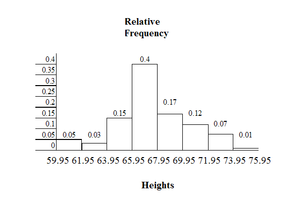
Example 2.6
The following data are the heights (in inches to the nearest half inch) of 100 male semiprofessional
soccer players. The heights are continuous data since height is measured.
60; 60.5; 61; 61; 61.5
63.5; 63.5; 63.5
64; 64; 64; 64; 64; 64; 64; 64.5; 64.5; 64.5; 64.5; 64.5; 64.5; 64.5; 64.5
66; 66; 66; 66; 66; 66; 66; 66; 66; 66; 66.5; 66.5; 66.5; 66.5; 66.5; 66.5; 66.5; 66.5; 66.5; 66.5; 66.5; 67; 67;
67; 67; 67; 67; 67; 67; 67; 67; 67; 67; 67.5; 67.5; 67.5; 67.5; 67.5; 67.5; 67.5
68; 68; 69; 69; 69; 69; 69; 69; 69; 69; 69; 69; 69.5; 69.5; 69.5; 69.5; 69.5
70; 70; 70; 70; 70; 70; 70.5; 70.5; 70.5; 71; 71; 71
72; 72; 72; 72.5; 72.5; 73; 73.5
74
The smallest data value is 60. Since the data with the most decimal places has one decimal (for
instance, 61.5), we want our starting point to have two decimal places. Since the numbers 0.5,
0.05, 0.005, etc. are convenient numbers, use 0.05 and subtract it from 60, the smallest value, for
the convenient starting point.
51
60 - 0.05 = 59.95 which is more precise than, say, 61.5 by one decimal place. The starting point is,
then, 59.95.
The largest value is 74. 74+ 0.05 = 74.05 is the ending value.
Next, calculate the width of each bar or class interval. To calculate this width, subtract the starting
point from the ending value and divide by the number of bars (you must choose the number of
bars you desire). Suppose you choose 8 bars.
74.05 − 59.95 = 1.76
(2.2)
8
NOTE: We will round up to 2 and make each bar or class interval 2 units wide. Rounding up to 2 is
one way to prevent a value from falling on a boundary. Rounding to the next number is necessary
even if it goes against the standard rules of rounding. For this example, using 1.76 as the width
would also work.
The boundaries are:
• 59.95
• 59.95 + 2 = 61.95
• 61.95 + 2 = 63.95
• 63.95 + 2 = 65.95
• 65.95 + 2 = 67.95
• 67.95 + 2 = 69.95
• 69.95 + 2 = 71.95
• 71.95 + 2 = 73.95
• 73.95 + 2 = 75.95
The heights 60 through 61.5 inches are in the interval 59.95 - 61.95. The heights that are 63.5 are
in the interval 61.95 - 63.95. The heights that are 64 through 64.5 are in the interval 63.95 - 65.95.
The heights 66 through 67.5 are in the interval 65.95 - 67.95. The heights 68 through 69.5 are in the
interval 67.95 - 69.95. The heights 70 through 71 are in the interval 69.95 - 71.95. The heights 72
through 73.5 are in the interval 71.95 - 73.95. The height 74 is in the interval 73.95 - 75.95.
The following histogram displays the heights on the x-axis and relative frequency on the y-axis.
52
CHAPTER 2. DESCRIPTIVE STATISTICS
Example 2.7
The following data are the number of books bought by 50 part-time college students at ABC
College. The number of books is discrete data since books are counted.
1; 1; 1; 1; 1; 1; 1; 1; 1; 1; 1
2; 2; 2; 2; 2; 2; 2; 2; 2; 2
3; 3; 3; 3; 3; 3; 3; 3; 3; 3; 3; 3; 3; 3; 3; 3
4; 4; 4; 4; 4; 4
5; 5; 5; 5; 5
6; 6
Eleven students buy 1 book. Ten students buy 2 books. Sixteen students buy 3 books. Six students
buy 4 books. Five students buy 5 books. Two students buy 6 books.
Because the data are integers, subtract 0.5 from 1, the smallest data value and add 0.5 to 6, the
largest data value. Then the starting point is 0.5 and the ending value is 6.5.
Problem
(Solution on p. 95.)
Next, calculate the width of each bar or class interval. If the data are discrete and there are not too
many different values, a width that places the data values in the middle of the bar or class interval
is the most convenient. Since the data consist of the numbers 1, 2, 3, 4, 5, 6 and the starting point is
0.5, a width of one places the 1 in the middle of the interval from 0.5 to 1.5, the 2 in the middle of
the interval from 1.5 to 2.5, the 3 in the middle of the interval from 2.5 to 3.5, the 4 in the middle of
the interval from _______ to _______, the 5 in the middle of the interval from _______ to _______,
and the _______ in the middle of the interval from _______ to _______ .
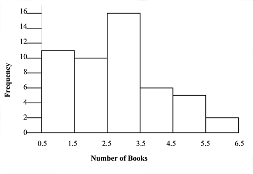
53
Calculate the number of bars as follows:
6.5 − 0.5 = 1
(2.3)
bars
where 1 is the width of a bar. Therefore, bars = 6.
The following histogram displays the number of books on the x-axis and the frequency on the
y-axis.
2.4.1 Optional Collaborative Exercise
Count the money (bills and change) in your pocket or purse. Your instructor will record the amounts. As a
class, construct a histogram displaying the data. Discuss how many intervals you think is appropriate. You
may want to experiment with the number of intervals. Discuss, also, the shape of the histogram.
Record the data, in dollars (for example, 1.25 dollars).
Construct a histogram.
2.5 Measures of the Location of the Data7
The common measures of location are quartiles and percentiles (%iles). Quartiles are special percentiles.
The first quartile, Q1 is the same as the 25th percentile (25th %ile) and the third quartile, Q3, is the same as
the 75th percentile (75th %ile). The median, M, is called both the second quartile and the 50th percentile
(50th %ile).
To calculate quartiles and percentiles, the data must be ordered from smallest to largest. Recall that
quartiles divide ordered data into quarters. Percentiles divide ordered data into hundredths. To score in
the 90th percentile of an exam does not mean, necessarily, that you received 90% on a test. It means that
90% of test scores are the same or less than your score and 10% of the test scores are the same or greater
than your test score.
7This content is available online at <http://cnx.org/content/m16314/1.17/>.
54
CHAPTER 2. DESCRIPTIVE STATISTICS
Percentiles are useful for comparing values. For this reason, universities and colleges use percentiles
extensively.
Percentiles are mostly used with very large populations. Therefore, if you were to say that 90% of
the test scores are less (and not the same or less) than your score, it would be acceptable because removing
one particular data value is not significant.
The interquartile range is a number that indicates the spread of the middle half or the middle 50% of the
data. It is the difference between the third quartile (Q3) and the first quartile (Q1).
IQR = Q3 − Q1
(2.4)
The IQR can help to determine potential outliers. A value is suspected to be a potential outlier if it is
less than (1.5) (IQR) below the first quartile or more than (1.5) (IQR) above the third quartile. Potential
outliers always need further investigation.
Example 2.8
For the following 13 real estate prices, calculate the IQR and determine if any prices are outliers.
Prices are in dollars. (Source: San Jose Mercury News)
389,950; 230,500; 158,000; 479,000; 639,000; 114,950; 5,500,000; 387,000; 659,000; 529,000; 575,000;
488,800; 1,095,000
Solution
Order the data from smallest to largest.
114,950; 158,000; 230,500; 387,000; 389,950; 479,000; 488,800; 529,000; 575,000; 639,000; 659,000;
1,095,000; 5,500,000
M = 488, 800
Q1 = 230500+387000 = 308750
2
Q3 = 639000+659000 = 649000
2
IQR = 649000 − 308750 = 340250
(1.5) (IQR) = (1.5) (340250) = 510375
Q1 − (1.5) (IQR) = 308750 − 510375 = −201625
Q3 + (1.5) (IQR) = 649000 + 510375 = 1159375
No house price is less than -201625. However, 5,500,000 is more than 1,159,375. Therefore,
5,500,000 is a potential outlier.
Example 2.9
For the two data sets in the test scores example8, find the following:
a. The interquartile range. Compare the two interquartile ranges.
b. Any outliers in either set.
8"Descriptive Statistics: Box Plot" <http://cnx.org/content/m16296/latest/#element-601>
55
c. The 30th percentile and the 80th percentile for each set. How much data falls below the 30th
percentile? Above the 80th percentile?
Example 2.10: Finding Quartiles and Percentiles Using a Table
Fifty statistics students were asked how much sleep they get per school night (rounded to the
nearest hour). The results were (student data):
AMOUNT OF SLEEP
FREQUENCY
RELATIVE
FRE-
CUMULATIVE RELA-
PER SCHOOL NIGHT
QUENCY
TIVE FREQUENCY
(HOURS)
4
2
0.04
0.04
5
5
0.10
0.14
6
7
0.14
0.28
7
12
0.24
0.52
8
14
0.28
0.80
9
7
0.14
0.94
10
3
0.06
1.00
Table 2.5
Find the 28th percentile: Notice the 0.28 in the "cumulative relative frequency" column. 28% of 50
data values = 14. There are 14 values less than the 28th %ile. They include the two 4s, the five 5s,
and the seven 6s. The 28th %ile is between the last 6 and the first 7. The 28th %ile is 6.5.
Find the median: Look again at the "cumulative relative frequency " column and find 0.52. The
median is the 50th %ile or the second quartile. 50% of 50 = 25. There are 25 values less than the
median. They include the two 4s, the five 5s, the seven 6s, and eleven of the 7s. The median or
50th %ile is between the 25th (7) and 26th (7) values. The median is 7.
Find the third quartile: The third quartile is the same as the 75th percentile. You can "eyeball" this
answer. If you look at the "cumulative relative frequency" column, you find 0.52 and 0.80. When
you have all the 4s, 5s, 6s and 7s, you have 52% of the data. When you include all the 8s, you have
80% of the data. The 75th %ile, then, must be an 8 . Another way to look at the problem is to find
75% of 50 (= 37.5) and round up to 38. The third quartile, Q3, is the 38th value which is an 8. You
can check this answer by counting the values. (There are 37 values below the third quartile and 12
values above.)
Example 2.11
Using the table:
1. Find the 80th percentile.
2. Find the 90th percentile.
3. Find the first quartile. What is another name for the first quartile?
4. Construct a box plot of the data.
Collaborative Classroom Exercise: Your instructor or a member of the class will ask e