Learn 'Mobile First' Web Design Using Bootstrap 3 by Rahul A. Sakla - HTML preview
Download the book in PDF, ePub, Kindle for a complete version.
Chapter 6 Buttons
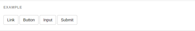
6.1 Button Tags
Use the button classes on an <a>, <button>, or <input> element.
6.2 Context Specific Usage
While button classes can be used on <a> and <button> elements, only <button> elements are supported within our nav and navbar components.
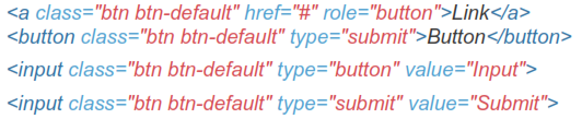
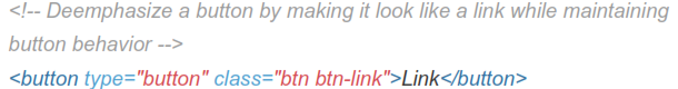
6.3 Links Acting as Buttons
If the <a> elements are used to act as buttons - triggering in-page functionality, rather than navigating to another document or section within the current page - they should also be given an appropriate role="button".
6.4 Cross Browser Rendering
As a best practice, we highly recommend using the <button> element whenever possible to ensure matching cross-browser rendering.
 Among other things, there's a bug in Firefox <30 that prevents us from setting the line-height of <input>-based buttons, causing them to not exactly match the height of other buttons on Firefox.
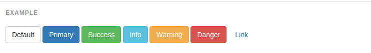
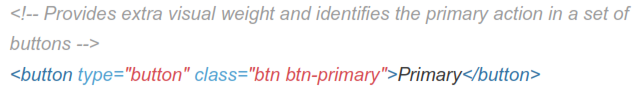
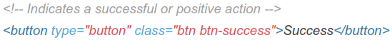
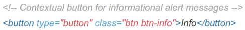
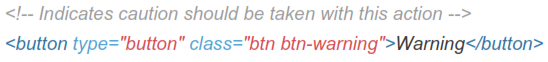
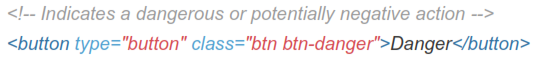
6.5 Style Options
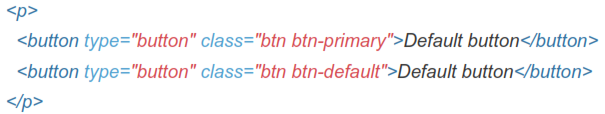
Use any of the available button classes to quickly create a styled button.

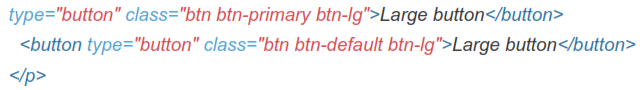
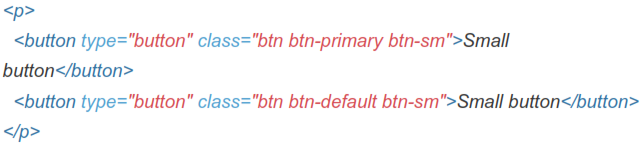
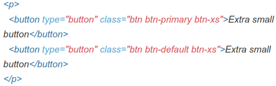
6.6 Button Sizes
Fancy larger or smaller buttons? Add .btn-lg, .btn-sm, or .btn-xs for additional sizes.
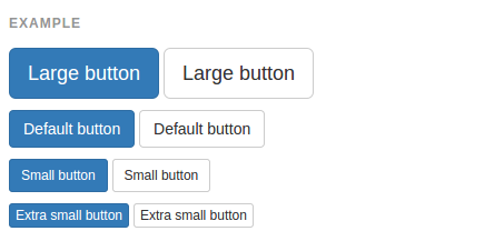

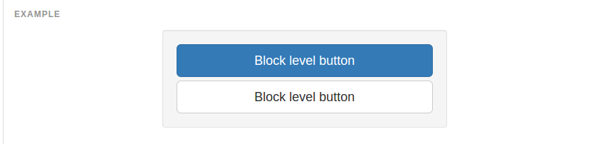
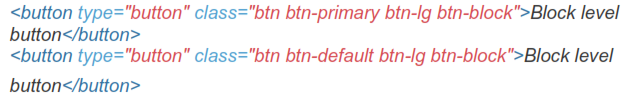
Create block level buttons-those that span the full width of a parent- by adding .btn-block.
6.7 Active State
Buttons will appear pressed (with a darker background, darker border, and inset shadow) when active. For <button> elements, this is done via :active. For <a> elements, it's done with .active. However, you may use .active on
<button>s (and include the aria-pressed="true" attribute) should you need to replicate the active state programmatically.
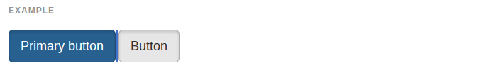
Button Element
No need to add :active as it's a pseudo-class, but if you need to force the same appearance, go ahead and add .active.
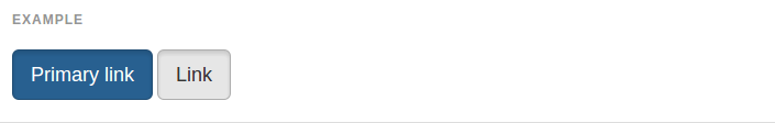
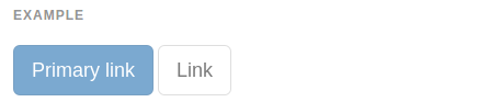
6.8 Anchor Element
Add the .active class to <a> buttons.
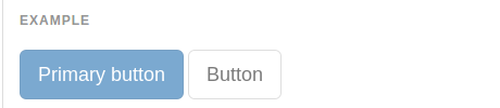
6.9 Disabled State
Make buttons look unclickable by fading them back with opacity.
6.10 Button Element
Add the disabled attribute to <button> buttons.
6.11 Anchor Element
Add the .disabled class to <a> buttons.