Learn 'Mobile First' Web Design Using Bootstrap 3 by Rahul A. Sakla - HTML preview
Download the book in PDF, ePub, Kindle for a complete version.
Chapter 5 Forms
5.1 Default Form
lndividual form controls automatically receive some global styling. All textual <input>, <textarea>, and <select> elements with.form-control are set to width: 100%; by default. Wrap labels and controls in .form-group for optimum spacing.
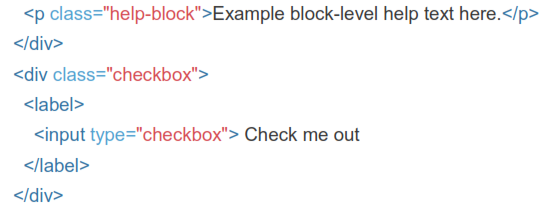

 Do not mix form groups directly with input groups. Instead, nest the input group inside of the form group.
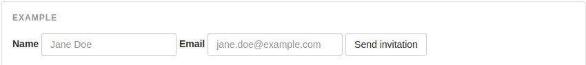
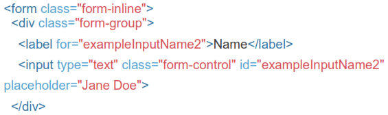
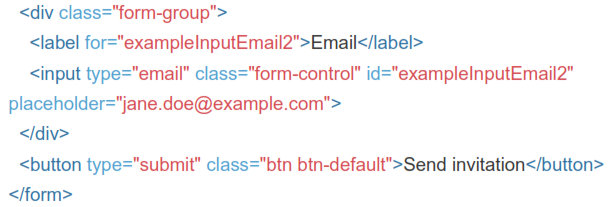
5.2 Inline Form
Add .form-inline to your form (which doesn't have to be a <form>) for left- aligned and inline-block controls. This only applies to forms within viewports that are at least 768px wide.
Inputs and selects have width: 100%; applied by default in Bootstrap. Within inline forms, we reset that to width: auto; so multiple controls can reside on the same line. Depending on your layout, additional custom widths may be required.
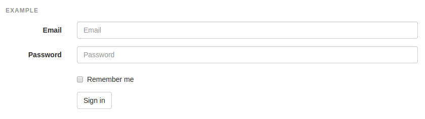
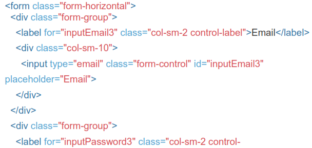
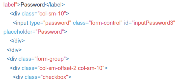
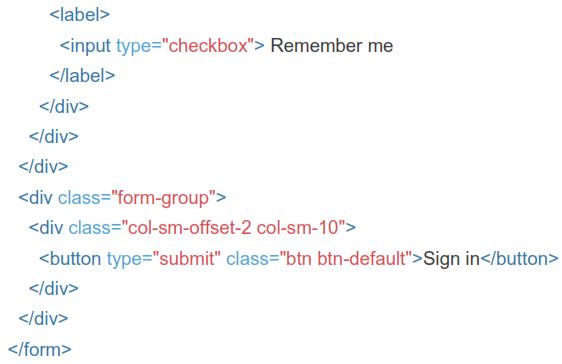
5.3 Horizontal Form
Use Bootstrap's predefined grid classes to align labels and groups of form controls in a horizontal layout by adding .form-horizontal to the form (which doesn't have to be a <form>). Doing so changes .form-group s to behave as grid rows, so no need for .row.
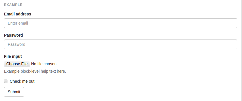
5.4 Supported Controls
Examples of standard form controls supported in an example form layout.
Inputs
Most common form control, text-based input fields. Includes support for all HTMLS types: text, password, datetime, datetime-local, date, month, time, week, number, email, url, search, tel, and color.
Inputs will only be fully styled if their type is properly declared.
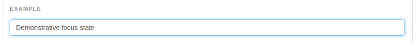
5.5 Focus State
Bootstrap remove the default outline styles on some form controls and apply a box-shadow in its place for :focus
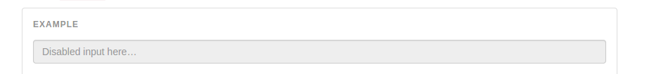
5.6 Disabled State
Add the disabled boolean attribute on an input to prevent user input and trigger a slightly different look.

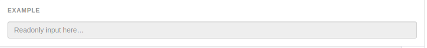
5.7 Readonly State
Add the readonly boolean attribute on an input to prevent user input and style the input as disabled.
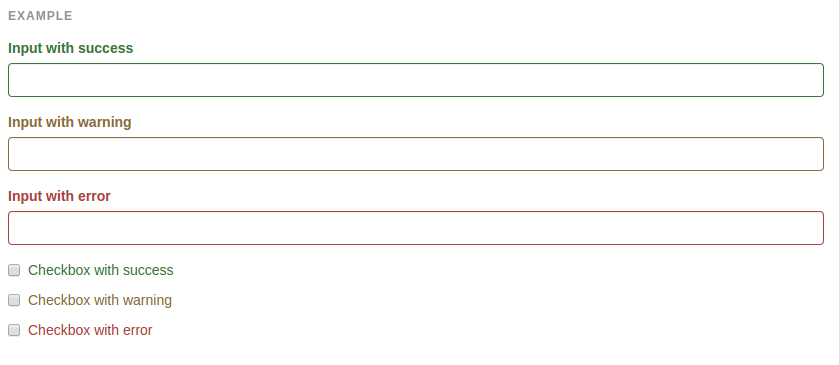
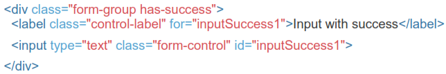
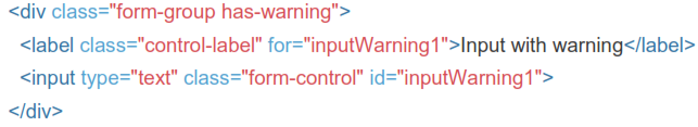
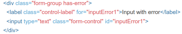
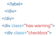
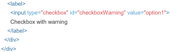
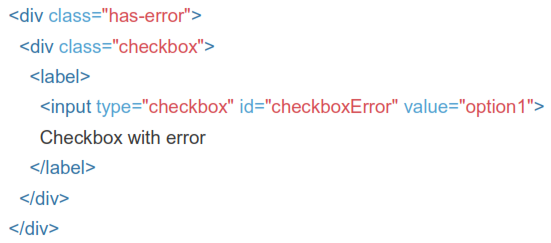
5.8 Validation States
Bootstrap includes validation styles for error, warning, and success states on form controls. To use, add .has-warning, .has-error, or .has-success to the parent element. Any .control-label, .form-control, and .help-block within that element will receive the validation styles.
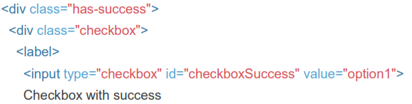
5.9 With Optional Icons
You can also add optional feedback icons with the addition of .has-feedback and the right icon.
Icons, labels, and input groups