
The Art by Dr Ved Prakash Bhardwaj - HTML preview
Download the book in PDF, ePub, Kindle for a complete version.
The Art
juxtaposition of colours. Like an intense
or subdued alap, the colours spread
across the canvas—somewhere lighter,
somewhere darker, sometimes forceful
and sometimes almost silent.
As one continues to look at his
paintings, the vision of the invisible
becomes increasingly illuminated. What
initially appears obscure gradually
acquires an emotional and visual
coherence, though it never becomes
completely transparent.
Kolte once told this writer that an artist
must have a reason for applying every
colour. A colour should not be placed on
the canvas without purpose. For him, it is
not enough to know how many colours to
use or where to apply them; it is equally
important to know where to leave colour
out. The spaces without colour are as
significant as the colours themselves.
At first sight, it may not be obvious
why a particular colour has been used
in one of Kolte’s paintings. But when
we look at the painting as a whole and
begin to consider the relationships
among its colours, those relationships
acquire significance. Colours develop
a kind of sociality, much like words in
poetry. A word gains meaning through its
relationship with other words; similarly, a
colour gains its expressive force through
its relationship with other colours. The
painting gradually unfolds like a poem.
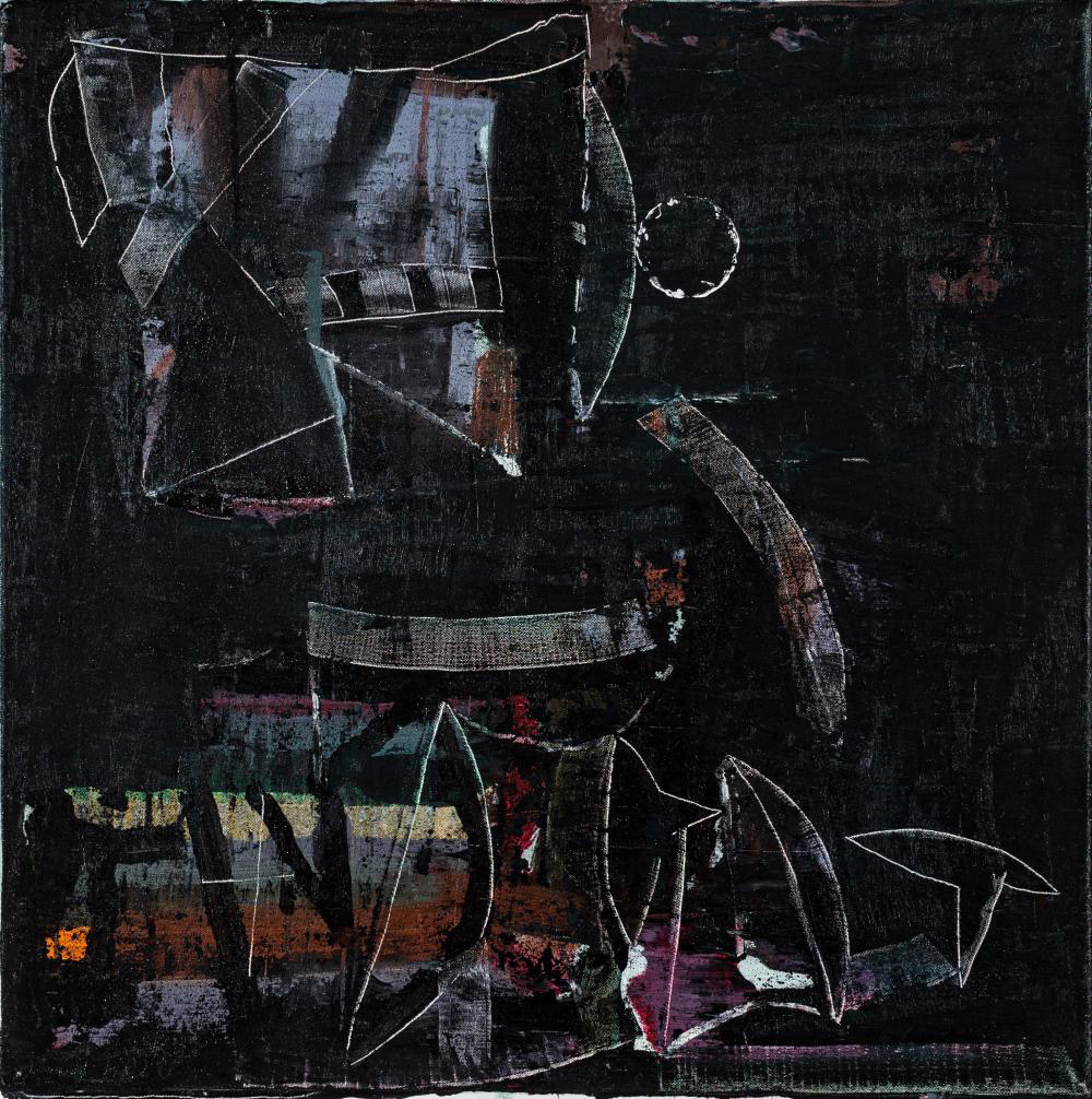
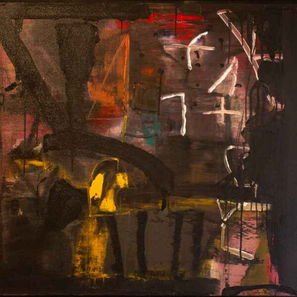
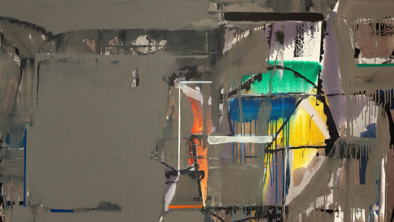
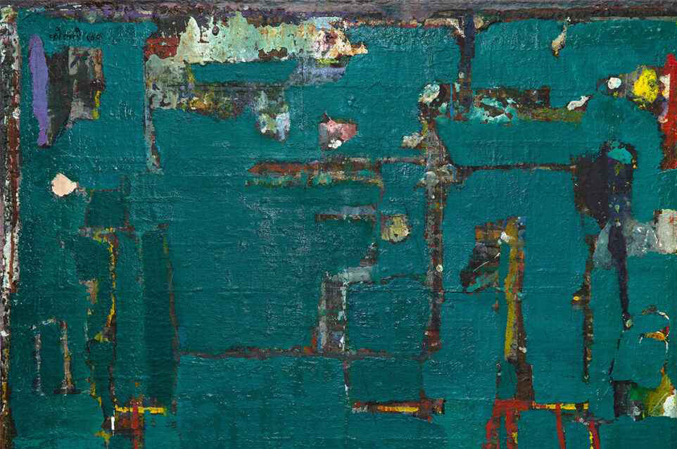
Kolte frequently works through
several layers on the canvas. He applies
successive layers of colour, often
beginning with lighter tones. Finally, he
covers a large portion of the surface with
a darker colour, but does so in a way that
allows the earlier colours to peek through
from beneath the final layer. This creates
a complex picture structure in which the
history of the painting remains partially
visible.
Sometimes this structure
evokes the architecture of a city; at
other times, it resembles a dream from
the night that one remembers only in
87