A Beautiful Mind (with a Big Mouth?) by John C. Dean - HTML preview
Download the book in PDF, ePub, Kindle for a complete version.
The New Model For Markets
In previous chapters we’ve shown how the income is spread across the population, we’ve compared the 60s to the modern era, finding a generally more prosperous life in years past, we’ve looked at the market over time and how it operates to move money to one side of the population, and we’ve seen how attitudes can develop on both sides of the money spectrum to blame each other for why things are so bad. While we’ve heard rhetoric about a smaller government and less debt, we continue in the self destructive mode of borrowing money to wage war and sacrifice our children to keep foreign markets under harsh US influence. There is no mistake, we are not hailed by the world as the peace loving respecter of national sovereignty. We may be conned at home to think that that’s what we’re all about. But it’s not true. We are the planet’s biggest bully and we have our might stretched out all over the world to try and maintain control. We are the world’s only super power. And yet we lost in Viet Nam with tragic loss of life and money. Korea was a “not so sure we did the right thing”. The Middle East is a mess because we have empowered a tiny nation to thumb it’s nose at its middle east neighbors, while we think we’re acting like the good Samaritan in trying to help fix it for everybody. The Palestinian cause is righteous in terms of wanting a sovereign nation for themselves within the homeland of another sovereign nation. Barricades and settlements work against this solution and we fail to slap hands. Why not make Jerusalem an international city of peace, owned and respected by the world and nobody’s capitol, or maybe it should be considered the world capitol of the God of your understanding, a peaceful city? Our motives in Iraq and Afghanistan must be CIA drug smuggling of heroin, and continued control and manipulation of the oil sources. Poppy fields were practically non-existent under the Taliban, and now Afghanistan is the world’s biggest producer of heroin, and it’s reaching America streets in volume. This could not be done without US military assistance. Saudi Arabia is one of our clients who receives US military protection in return for sympathetic oil treatment with the American and British oil cartels. The “W” presidency shows the most blatant example of this corporatocracy that rules the world for a few rich people, while raping the US’s money resources and killing our children, and not just trumping up terror (911), but actually causing it with our invasion of Iraq and aggressive, no notice, raids of Iraqi homes. But I am drifting off of our economic solution because it encompasses a retreat from imperialism and a retreat from corporatocracy and involves a changeover to a smaller, more responsive, and more peaceful US government, who’s business is to provide life, liberty, and a level playing field for the pursuit of happiness for all Americans. Let’s proceed with the appropriate budgetary steps for a better economy and a greater peace (which are very compatible).
The way I plan to make this work, is to start at the poor end and calculate, with the use of our income curves, the money needed to raise up the low end to mostly house buying wages. That money will come from a reduction in government spending and an adjustment to industrial spending. A makeover of taxation will finalize the work, and the result will be a more thriving economy.
Here is my first attempt to create a more thriving economy for our nation that should put 75% of Americans in their own family’s house, and should provide a level playing field if new capitalism guidelines are implemented. This structure should endure if minimum wages are tied to the more expensive things in the family budget so that wages truly track inflation. Let’s trace the impact of such a change through the budgets and flow diagrams and see how it works. To start with, for the wage increase we’ll raid other income from the business engine to temporarily cover the wage increase. In Appendix 1 section 3 we presented the total income pie for 2007. It included $1.1 T business income, $.765 dividends, $1.27T interest, and $1.718 capital gains (totaling over 5T). The distribution of this extra income over the 1%, 9%, and lower 90% of the population is, by Wolf’s tables, 12.2% or $613 billion for the 0-90% group, $1.913T, the 90-99% group, and the 1% group, $2.495T.
If one wants to look at the individual elements of extra income and estimate their division across the population, one can start at the top of Wolf’s table, Chapter 2, where business equity should reflect share of business income from the income pie, business income slice. So the extra $1.102T is probably divided up as 62.4% for the 1% group or $688Billion, 30.9% or $341Billion for the 9% group, and 6.7% or $74billion spread over the lower 90%, presumably in the shape of a rising curve toward the 90% position.
1% 9% 90%
Business Income $688 Billion $341 Billion $74 BillionInterest income of $1.266T, would be mostly due to trusts so we have $492 Billion $513 Billion $261 Billion
Dividend income of $.765T would go with stock ownership, so we have $293Billion $328Billion $144Bilion
Capital gains of $1.718 T would go with commercial (non-home) real estate and
stocks. Stocks represent about $7.7T (http://moneynews.com/FinanceNews/US-NetWorth/2010/03/11/id/352389),while commercial real estate face value of $3.3T. I’ll
bias the table rates above as 2/3 the difference toward stocks from non-home real
estate, using these estimates for percent earnings by income group. we get
Capital gains $601 Billion $770 Billion
$347 Billion
Rents of $168Billion goes with non-home real estate, or $48billion $82Billion $39Billion
This covers all non-pension income and is part of the income curve (except capital gains). http://www.irs.gov/taxstats/indtaxstats/article/0,,id=133521,00.html
The total of non-wage income from the above (as presented in Ch 2) is 1% gp: $2.122T ; 9% gp: $2.034T; and 0-90% gp: $865Billion which adds up to $5.021T. But by Wolf’s tables the 0-90% group should be getting 12.2% or $613 billion, the 90-99% group, 38.1% or $1.913T, and the 1% group, $2.495T (49.7%) as mentioned above. I’ll use Wolf’s values again. A simple market flow diagram is shown below to represent the current economy.

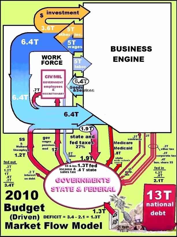
The size of the arrows is indicative of the size of the money that’s moving. The propensity to purchase curve from Appendix 1 section 8 shows a total consumed of about 6.8T with 4.3 not consumed. I show 6.4T driving goods and services and 3.6T added to the net worth of the nation through investment (see average increase in net worth in Appendix 1 section 11) and the total plus government wages ($1T) is the total income for the year, about 11T as in our 2007 pie chart. I don’t know why the government payments of 1T are added to income because they are taken from income in taxes before they come back as wages. There’s no net addition. The IRS tax data used for the income curves is real and is reflected in the flow diagram. The numbers are simplified a bit (rounded up or down to be fewer decimal places). I included state income taxes as this money is not available to drive the business engine. The sum of 1T for federal salaries, retirement, and medical coverage includes .3T medical which is split off in the flow diagram in the CIV/Mil government box as medical services rendered by government doctors and hospitals? So .7T of that money comes back in the stream to create Goods and Services demand. Meanwhile 1.2T comes into the work force box (people box) as Social Security and welfare. So 1.9T comes from the government that is spent on the economy. Unfortunately the benefit of the 1.9 is eliminated by the taxes collected to do this, (1.3T fed .6T states). As you can see, the 1.9T flow of taxes to the governments box significantly reduces the size of the drive on the economy in demand for goods and services. Medicare and Medicaid payments are made to the health provider companies in the business box. The Medicare .8T and contracts .2T (total 1T) into the business engine is almost balanced by the other tax .2T, corporate tax .2T, and business share of Social Security .4T (total .8T) coming into the government. So $6.4 T plus 5T work, drives the business engine to produce 6.4T in goods and services and $5T in wages. Notice that the federal government borrows about $1.3T/yr to make this budget work. This is the current outrageous deficit. It hurts our nation more every day Now the investment dollars going back into the business engine are not about “coal to run the engine”. They are dollars used by the business machine to produce other income while preserving the original investment of the 3.6T for the investors. The investors are putting in about 3T a year, but the engine possesses vastly more of the investors’ dollars to work with in order to produce the 5T other income each year. In fact the business engine holds the financial wealth of the nation, about 43T. So investment dollars are not one for one with other income dollars. The 5T other income is part of the profit on the 43T in use for a given year. And the nation’s net worth goes up by investment money and inflation each year. But how does $6.4T drive the business engine to produce both 6.4T in goods and services and 5 T in wages? The secret is the multiplication of the dollar as it ripples through the economy plus the multiplier of about 2-3 at the retail level. Before we study the multiplicative effect of the dollar, the reader interested in a peek inside the 2010 flow diagram is shown in Appendix 1 section 16.
MULTIPLICATIVE EFFECT OF A DOLLAR
The next figure shows the basic sequence of a business transaction in the market.
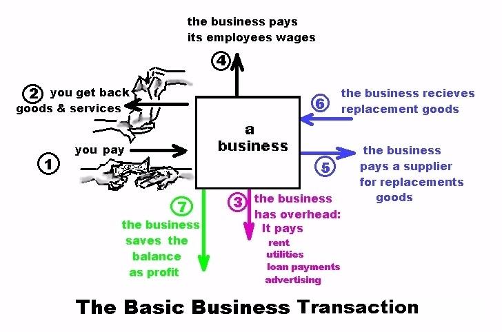
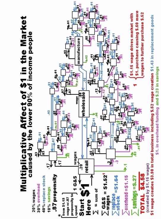
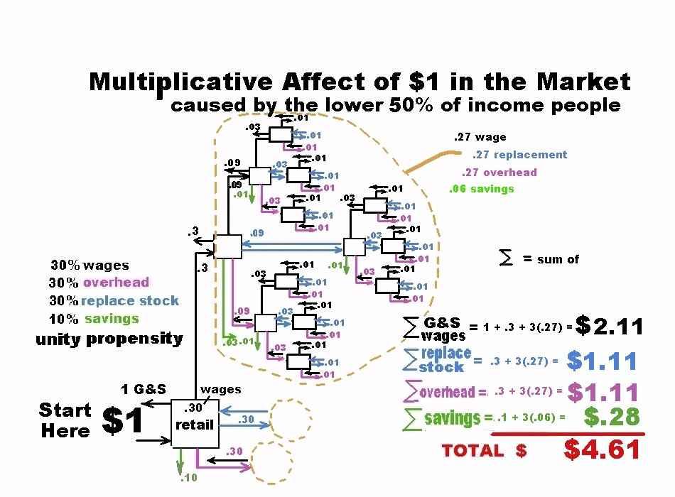
Think of a business inside the box shown and follow the sequences 1 through 7 to understand how the business works in that sequence. You find a business that has what you want so you go there and pick the item out and pay for it. They give it to you or provide the service you paid for and you leave. Now the business uses the money you gave them, plus the money received from all other transactions that month to pay its bills and rebuild its stock and save the balance as its profit. It covers its overhead of phones, power, and space. It has employees and the owner takes a salary so wages are paid to keep the help to run the business. If some goods are sold, stock in those goods is replenished for future sales. After he’s paid for his overhead, paid his wages, and replaced stock, he may keep what is left over as profit. A breakdown of the money coming in can be made to study the efficiency of the business. If one dollar comes in on the transaction what proportion of that dollar is spent on the various parts of the business? How much is the overhead? How much are the wages? What does it cost to replace stock? What can be projected as savings? The next figure shows an example breakdown of expenses for a business. The breakdown for the example is assumed to be 30% overhead, 20% wages, 40% replacement, and 10% savings.
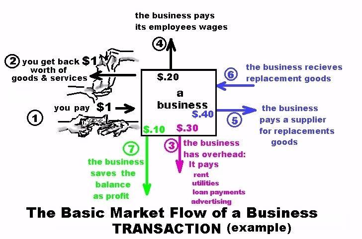
The money that goes out to pay wages and overhead and replace stock actually feeds other businesses. The employee takes his wages and spends it on his living expenses, his overhead, replacement of food and fuel, his other purchases, and his savings. The overhead money goes to landlords, power companies, telephone companies, advertisers, and the bank to pay off loans. Each of these endeavors is like a business with its goods and services and wages and costs. So the money continues to cycle through until the remnants of that dollar are no longer worth tracking. Notice that the retail business that started had to bump the price of the replacement goods from $.40 to $1. to make the money at sale to pay for everything else. He sold an item for one dollar that cost him 40 cents so that he would have the other 30 cents to pay for his store front, 20 cents for his employee’s wages, and his 10 cent profit, plus his 40 cents back so that he could buy another one of those items from the wholesaler. I haven’t showed the business taxes, but they would generally be taken out of the profit, and the wages. The multiplicative power of the dollar on the market can be estimated by tracking the progressive expenditures from one business through the next starting at the first store and carrying the division of the money amongst the many businesses that follow, using money in as the purchase of goods and/or services from the next business, be it for overhead, stock, or a wage purchase. The propensity to spend the income dollar will vary with class of purchaser. The top 10% people in income have an estimated .39 propensity to spend (Appendix, sect 8), while the 0-90% income people have a .87 propensity to spend. This represents the fraction of each dollar spent by each of the two groups to drive the market. We’ll use the 0-90% group as an example in our market multiplier work. If you multiply the wages earned by the propensity it tells you, on the average, the expenditure for that group on goods and services. Now the iteration is very large and congested looking and you are not expected to absorb the whole thing, but the figure on the next page shows the layout and results of the spread of one dollar in the market, where, for simplicity, all businesses are assumed to have the same ratios for wages, replacement stock, overhead, and savings rate. If a number is lower than one cent (rounds off to zero) I stop the iteration at that spot in the spread.
I use separate colors to keep track of what the money is spent on. The starting dollar actually comes from a wage of $1.15 because the lower 90% of income people only spend .87 of their wage on goods and services (again from Appendix 1, section 8). So .87 X $1.15 = $1 starts the purchases in the diagram. If we separately looked at the lower 50% of income earners all their wages would be spent, so the 70-90% group lowers the average overall to .87 for the whole group (from 0-90%). If we want to create jobs for the low end and raise their wages, then because they spend more, there will be a greater multiplier for the wage component of the business created.
So two pages over I show the result of the market multiplier for an equal breakdown between wage, replacement, and overhead with the same .10 savings for the 50% group that spends all of his wages on goods and services. The total of 4.61 is with respect to the input wage and expenditure of $1. The first example with a .87 propensity and 20% wages created half again the goods and services bought by wages it created with a 3.98 multiplier from wage to end result. So if more of the business receipts are put into wages and all of those wages are spent on the economy, then greater iteration of the original purchase will occur. Notice that in the second case (two pages over) the wage needed to buy the first item is replicated again in the system. A dollar and eleven cents of wages are caused by the guy who earned a dollar and spent it to start the cycle. Since the diagram is the ripple of one sales event, it reproduces itself each payday when another dollar is put into the market by our employee. So he’s basically facilitating the existence of another worker in the system at his level of income (times 1.11). Plus there’s a $.28 savings on each iteration. The multiplier on overhead and replacement is also impressive.